Digital Methodology Image Project (In-Progress)
A. Image Creation
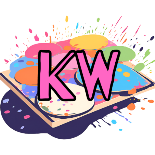
Favicon:
Header Images:

Homepage Header (Location: Here)

Blog Posts Header (Location: Here)

My Writings Header (Location: Here)
Backgrounds:

Homepage Background (Location: Here)
B. Written Analysis
The images I have created include a favicon and three header images for three different pages of my website. The favicon is a digital drawing of a painting palette with the initials “KW” in hot pink text. The header images are rectangle images of collages. The goal of creating my favicon was to make a logo that would encourage a reader to mentally associate my name with the concept of creating. The header image of the homepage displays 4 images of myself at different events (Eagle Con, being an orientation leader, etc.) and 4 editing/art pieces I have made, as well as the name of the website and myself written in pink text in the center. The header image of my “Blog Post” page displays 8 images of editing projects I have created, and the title “Blog Posts”, along with my name written in red text in the center. The header image of the “My Writings” page displays 8 different literary and text-based projects of mine, along with the title “My Writings” and my name written in gold text in the center. My headers were designed to showcase different projects I have made based on their respective pages (ex: The “Blog Posts” page has examples of other digital pieces I have created) while also being simplistic enough to appear as an approachable display of some of my works. Although I created a very simplistic background for the homepage, I decided on a light orange color to compliment the pink from the text of the header page. For all of these pieces, I have created alt text descriptions to make the content more accessible. I also tried to stray away from colors that are commonly difficult for colorblind or visually impaired people to see, such as bright red or green.
The header images were created using one of Canva’s website design templates. For my favicon, I created a sketch for a logo and then used the digital artwork software Clip Studio Art to add extra pen and colored layers over the sketch. I then placed the layers onto Pixlr and edited them into a cohesive 1×1 ratio image. I chose to utilize Canva to create the header images because of my prior experience and familiarity with the site. Their extensive library of templates helped me create a format for the collage that looked visually appealing. I also chose to use Clip Studio Art and Pixlr to create and edit the Favicon due to my prior experience with them, and they both had easily understandable tools that helped me edit the layers into a cohesive design. I created the home page background by using the Windows Paint software on my computer to find a color scheme I liked, and then I used Canva to change the ratio of the image to 4×5 so it would fit on the website screen. Overall, I was satisfied and confident in my work on all of the tools and can see myself utilizing them in future endeavors while expanding my digital identity.
So far, I am quite pleased with the images I have made for my website. I think they do a good job of showcasing my different skills cohesively and simplistically enough for the average viewer to become more informed about my abilities and endeavors. I hope to use the same editing processes in order to create more header images and backgrounds. I am also pleased by the increased accessibility of the webpage, as well as improving the overall visual appeal. However, I would also like to expand my editing experience by creating different kinds of images for the gallery page, including ones you can click on the website to zoom in/out of.
No responses yet